State Board Logos
Overview
Washington State Board for Community and Technical Colleges’ logo represents hope, supportiveness, and lead or guide. The dark blue star is the organization, or the solid foundation, that branches off and supports transfer, workforce, and basic education.
- The primary logo minimum size recommendations are 180px or 1.875” horizontal width.
- The secondary logo should be used in situations where a vertical layout is necessary. Minimum size recommendations are 192px or 2” vertical height.
If you have questions or need a different file format, contact SBCTC Communications.
The primary logo should be used whenever possible in both print and digital applications including brochures, letterhead, business cards, website, screen printing, and signage.
Logo colors: Pantone 2555 C, 285 C, 325 C, 7405C
Primary

Download
- Primary color logo jpg (300 dpi, for print)
- Primary color logo jpg (72 dpi, for web)
- Primary color logo png (72 ppi, for web)
Secondary

Download
The primary and secondary reversed logos should be used on a dark background for black and white print ads, one-color screen printing, and cutouts (e.g. banners, signage).
Primary
Download
Secondary

Download
The State Board's black and white logo features a solid-colored foundation and outlines its supporting rays. When resizing the vector logo in Illustrator, make sure to select “scale strokes and effects” in the preferences panel for consistency with the stroke at all sizes.
The primary and secondary black and white logos should be used on a white background for black and white print ads, one-color screen printing, and cutouts (e.g. banners, signage).
Primary

Download
- Primary black and white logo jpg (300 dpi, for print)
- Primary black and white logo jpg (72 dpi, for web)
- Primary black and white logo png (72 ppi, for web)
Secondary

Download
Primary

Download
- Primary reversed logo for dark backgrounds logo jpg (300 dpi, for print)
- Primary reversed logo for dark backgrounds logo jpg (72 dpi, for web)
- Primary reversed logo for dark backgrounds logo png (72 ppi, for web)
- Primary reversed logo for dark backgrounds with transparent background logo png (72 ppi, for web)
Secondary

Download
- Secondary vertical reversed logo for dark backgrounds logo jpg (300 dpi, for print)
- Secondary vertical reversed logo for dark backgrounds logo jpg (72 dpi, for web)
- Secondary vertical reversed logo for dark backgrounds logo png (72 ppi, for web)
- Secondary vertical reversed logo for dark backgrounds logo with transparent background png (72 ppi, for web)
Usage and Clear Space
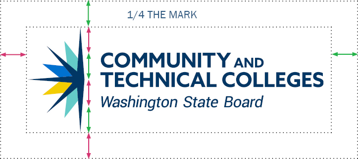
The clear space requirement is designed to maintain the integrity of the logo. This ensures visibility and legibility. The minimum clear space of the State Board's logo is 1/4 the size of the north/south line of the mark. Try to maximize clear space whenever possible.
Usage and What Not to Do
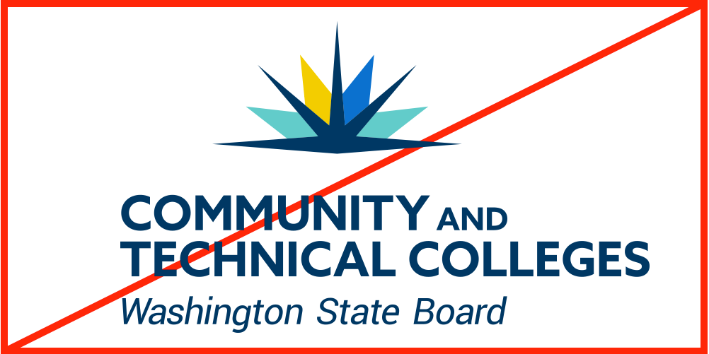
Do not rotate the compass mark from its original vertical position to horizontal:
Do not put the full color logo on a dark background. Instead, use the reversed color logo above:
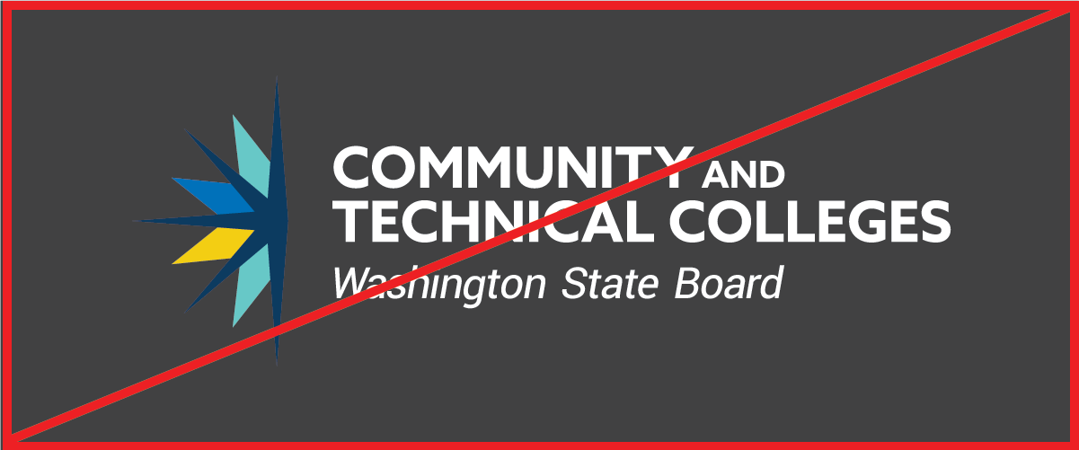
Do not use the compass mark on its own:

For exceptions, contact SBCTC Communications.